New Videos: Justin Gerard, Steve Rude, Tribes of Kai and SFAL!

Hi, all,

We’ve been hard at work on a series of new books. I will post a fresh update on all Flesk fall releases soon. In the meantime, please enjoy our latest videos.

Interview with Justin Gerard during the Spectrum 22 judging event. Justin talks about his latest book projects and gallery events, working with his wife Annie Stegg Gerard, his influences and about Spectrum. This was filmed at the Flesk offices on February 28, 2015 in Santa Cruz, California.

Steve Rude visited our Flesk offices in Santa Cruz, California on February 19th to work with us on his new book, The Nexus Chronicles. This new collection assembles eight of Steve’s favorite Nexus creations scanned direct from the original art. This 304 page book comes out this fall. For now, you can watch Steve provide a drawing demonstration of Nexus in his sketchbook.

A simple spark sets in motion a power struggle ablaze in conflict. Fully painted by Daren Bader and written by Lance HaunRogue! Tribes of Kai is an oversized, full-color hardbound book boasting sixty exciting pages of story and pinups by top creators including Frank Cho, Dave Palumbo, plus Julie Bell and Boris Vallejo. Trade and Deluxe Limited editions will be available in August, 2015 from Flesk Publications. Pre-order through the Flesk Kickstarter campaign and get free bonus items.

Spectrum Fantastic Art Live runs May 22-24th, 2015 at the Kansas City Convention Center, Kansas City, MO. For full details and to purchase tickets visit: spectrumfantasticartlive.com

Be a part of Spectrum Fantastic Art Live by attending this event that celebrates the fantastic art and its creators. SFAL is a fantasy-focused art fair, in which creators can display, share and sell originals, prints, sculpture, crafts, toys and more to an audience of fans and peers. There is something for everything, including presentations, panels, displays, portfolio reviews, workshops, educational opportunities and the Spectrum 22 awards ceremony. In short, our goal is to honor the artists and put on a fantasy art convention that anyone is welcome to attend.

John

John Fleskes

Flesk Publications
Flesk Publications on Facebook
Spectrum Fantastic Art
Spectrum Fantastic Art Live
Spectrum Fantastic Art Live on Facebook

Text and photographs copyright © 2014 John Fleskes. Videos © 2014 Flesk Publications. Artwork © 2014 its respective artists. All Rights reserved.

Interview with Mark Schultz about his new art book, “Carbon”

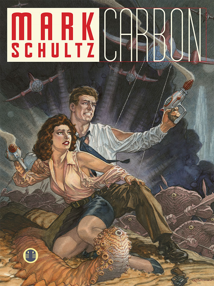
The new art book, Mark Schultz: Carbon, collecting Schultz’s most recent works is off to the printer. Our advertised release date is August 1st, but we are hoping to have copies at our Flesk booth just in time for the San Diego Comic Con. (I’ll keep you updated.)

You can pre-order copies at our Kickstarter campaign, which gets you a special price and bonus goodies. (Click here to visit.) Afterward, the book will be available for pre-order from our website, although without the Kickstarter goodies.

I have conducted an interview with Mark about his new book and what you can expect to see inside.

John Flesk: Carbon will contain material completed over the last two years. What can one expect to find within the book?

Mark Schultz: I’m focusing more on process than ever before. The feedback I get from readers in general is that there is a great interest in seeing the work that goes into creating the finish. So, in Carbon, I consciously tried to give a little more information on the steps that lead to the finish. There’s an entire section showing, step by step, the visual evolution of the newly identified dinosaur I rendered, along with text describing my work with the paleontologist.

There’s a greater concentration on my evolving use of color, too. The subject matter, I admit, is pretty much what would be expected of me: lots of adventure, speculative fiction stuff and tough girls.

JF: When did you start experimenting with watercolor highlights in your works and can we expect to see a shift to more color in your art?

MS: Defining, modulating and sharpening watercolors with carbon pencils is something I’ve been playing with for several years now. At first, I was pretty conservative with the color, as you suggest, doing more tinting of carbon pencil drawings than anything else. Recently, though, I’ve gotten a little more confident and have started leaning more on the color and less on the drawing. The cover to Carbon is my most extensive shift to color yet.

It’s an evolving process and my goal is to get to the point where I feel I can, when I choose, ditch the use of the pencils altogether and achieve the effect I want with the watercolor alone. Its part of my bigger plan to loosen up, become a bit more painterly and not so constrained by “line” when a particular piece would work best that way.

JF: Why have you worked primarily in black and white for much of your career?

MS: When I started my career in comics, with Xenozoic Tales, working the story in black and white was the only avenue open to me. That’s what my publisher at the time, Kitchen Sink, could offer. Which was not a problem—I’ve always loved monochromatic work, whether it be in comics, illustration, prints or movies.  When you get rid of color, there is a greater emphasis placed on composition, lighting, and texture—and you can achieve all sorts of atmospheric stuff with those elements.

When I was later given the opportunity to do Xenozoic in color, I chose to continue it in B&W, because that is how I’ve come to see it. I can’t imagine drawing the comic’s series as anything other than a monochromatic work.

Don’t get me wrong: I like working in color, too. But I feel a certain affection for B&W because it has become, I think, marginalized in our world where color is now so easily achievable in any media. People have come to think of B&W work as representing a drop in quality, not as an aesthetic choice. I want to see that attitude change.

JF: Do you have an interest in expanding into doing more color works in the future, either by adding watercolor to your brush and ink works, or full watercolors or even oil paintings?

MS: I absolutely do want to have the ability to create color work when it’s needed. It’s a matter of me putting in the reps and getting my technique to where I feel comfortable with my chops. Right now, my focus is on developing more command of watercolor—specifically transparent watercolor, of which Winslow Homer and John Singer Sargent were perhaps the absolute top practitioners. (And I am very well aware that, with those two, I have picked impossibly high standards to shoot for.) I have this idea of where I want to go with color illustration done in transparent watercolor—and its great ability to duplicate the quality of natural light—that could nicely compliment my brush and ink illustrations.  I hope.

JF: When comparing your art from three to four years ago to something you are working on today, how do you feel you have grown artistically in this time frame? Why?

MS: I don’t know if I’m the right person to ask. It’s all too close to me. I do feel that I’m getting closer to achieving the moods and feelings I want in my work, but I’m not sure how others perceive it.

Having said that, from my perspective, the last few years have seen a lot of growth in my work. I’m happier with what I’m producing today than I ever have been before. It sort of feels like the first twenty years of my career was all about laying groundwork and trial and error, and in the last few years I’ve been able to actually move forward into something I feel is my own.

And having said that, I’m always miserable about not getting on paper what I’m seeing in my head. (Not an uncommon condition among artist-types.)

JF: Your brush and ink art appearing in Carbon is a bit looser than pieces completed in the past. Has this been a conscious decision?

MS: I’m glad you think so—loosening up is something I’ve very much wanted to move toward. I drive myself crazy with my tendencies to carefully control every line I lay down. It’s obsessive and drains energy from finishes—and is one reason I think many people tend to like my preliminaries more. So, yes, I have been very consciously working on strategies to help me keep my finishes looser and livelier. The goal is always to create an illusion of movement and energy in a still image.

JF: How much does the imagery depicted within Carbon reflect your personal interests?

MS: Hmm—let’s see: dinosaurs, warrior women, Vikings, kitty cats, the sea. Pretty much 100% personal interest. I’m trying to think if there’s anything in here that I would have chosen not to do, if I had the choice. I don’t think so. I think that, if you take on the work of creating something, it’s your job to find a way of making it personal—making the piece something that has meaning to you, regardless the subject matter. If you can’t figure a way of doing that, the project probably isn’t right for you.  Uh, oh—I’m starting to lecture…

JF: Then I’ll change gears. How do you think Carbon differs from any of your previous art books?

MS: Bottom line, it’s bigger and more comprehensive. I think the production is stepped up a big notch, along with my showcased works. The 12” x 9” dimensions and the extra gatefolds really allow us to impressively expand the size of some of the pieces—sometimes close to the original dimensions. The use of color throughout—even the black and white pieces that are reproduced in color so that the paper tone and blue line work pop out—is more extensive and better balanced that ever before. And, as I mentioned elsewhere, there’s a greater focus on my process, both with preliminary and production works and in text.

I wanted the Various Drawings collections to have the quality of museum exhibition catalogues, and I think we achieved that in spades. I want Carbon to be a looser, more varied, more immersive experience.  I think we’ve hit that, too.

JF: I do too, Mark. Thanks for your time!

Enjoy,

John

John Fleskes
Flesk Publications
Interview copyright © 2013 John Fleskes and Mark Schultz. Art copyright © 2013 Mark Schultz

Links:
Mark Schultz Kickstarter Campaign
Mark Schultz books from Flesk Publications


John Fleskes Interviews from 2006 and 2010

I’m moving these pair of interview links with me over from my old Flesk site to archive here on my blog. One of which is fro 2006 and the other from 2010. As I skim through them it’s interesting to see how I was thinking back then.

Jason Sacks at Comics Bulletin has interviewed Flesk publisher John Fleskes regarding his working relationship with William Stout and the process that goes into making a Flesk art book. You can read it at the Comics Bulletin website here. From December 2010.

Bill Baker interviews John Fleskes for World Famous Comics web site. Read it here. Originally conducted in October 2006.

Enjoy,

John

John Fleskes
Flesk Publications


Mark Schultz “Various Drawings Volume Two” Interview from 2006

Mark Schultz responds to questions about his new book, Various Drawings Volume Two, Xenozoic Tales, and his artistic style. Originally conducted in 2006 by John Fleskes. Moving to my blog for archival purposes.

Flesk Publications: For this second collection of your drawings, how is it different than the first volume?

Mark Schultz: I think there’s more of an emphasis on my recent work in this volume, but the formula remains pretty much the same as in Vol. 1: a variety of preliminary as well as finished works, variously rendered in ink, graphite and carbon pencil. Still, there is some older material, chosen because it has either not been previously published, or was published in a very limited venue. The biggest difference is probably in tone—when I’m choosing work for a given collection, part of the decision-making process involves developing a kind of rhythm and connection between the drawings. Certain drawings and subjects just seem to hang together better than others do. I think the tone of Vol. 2 is noticeably different than that of Vol. 1—it’s somewhat more varied, looser…

FP: Various Drawings Volume Two features a gatefold of your first sequential artwork in years; a thirties Sunday strip featuring a Xenozoic Tales topper, and Flash Gordon main feature. How does it feel to briefly get back to storytelling? Was it challenging?

MS: Storytelling, for me, is the biggest challenge. Producing sequential art has a much higher degree of difficulty than simple illustration. I love telling stories in the comics format, and only wish that I was fast enough to do it more regularly. It’s incredibly time-consuming, drawing all the panels necessary to tell a story with the kind of visual techniques I enjoy using. I am on an eternal quest to simplify my style appropriately for sequential use. Hasn’t happened yet, but I’m trying.

FP: You drew a sultry pin-up style illustration of Hannah, which is included in the book. Is this pin-up style a first for you?

MS: I’m very conscious of the large audience out there that enjoys pin-up type cheesecake. I’m not sure this particular piece is so much something entirely new for me, as it is an evolution. I’ve drawn Hannah and other female characters in sexy poses before, but I’m probably pushing my own envelope here a little. Generally speaking, I like my females to look like they can take care of themselves. I don’t do that “baby doll, let’s-play-dress-up” thing. I’m hoping that while this particular drawing of Hannah maybe pushes the pure sex appeal further than I have done in the past, that she still looks like the real deal.

FP: Who are some of your favorite pin-up artists?

MS: Gil Elvgren is, in my opinion, the best of the best. In addition to him, I’ve always enjoyed Petty. And, more contemporarily, studying Dave Steven’s work has taught me a lot.

FP: Is there a personal favorite piece in VD2, which you are especially proud of?

MS: I’m pretty happy with all of them, or they wouldn’t be in there. (I’ve got a lot of drawings that will never make the cut.) I’m pleased in general with the more recent work, because I can see that my drawing abilities are continuing to develop and grow. The frontispiece—the scuttled SubHuman cover, is particularly interesting to me because I penciled and did some inking on it back in 1998. When I picked it up again to finish it this year, I felt I needed to redo much of the inking because it didn’t work for me anymore. I feel like I now have a much more “solid”—a stronger, more dynamic—inking style.

FP: What are you working on now?

MS: I’m working on a number of private commissions as well as starting in on a storybook tentatively titled Storms At Sea—a combination of text and illustration that will be published by Flesk in 2007. It’s a hardboiled global conspiracy cautionary tale, with lots of opportunities for wildly varying illustrations. I’m writing it, and roughing out the graphics, now.

Beyond that, I continue to write the Prince Valiant strip in the Sunday funnies—gorgeously rendered by Gary Gianni—and draw the occasional comic book cover.

Mark Schultz Interview © 2006 Flesk Publications. All rights reserved.

Mark Schultz “Various Drawings Volume One” Interview from 2005

Mark Schultz responds to questions about his new book, Various Drawings Volume One, Xenozoic Tales, and his artistic style. Originally conducted in 2005 by John Fleskes. Moving to my blog for archival purposes.

Flesk Publications: What prompted you to work on a collection of your drawings?

Mark Schultz: Over the last few years a good number of people who follow my art have expressed their interest in seeing a collection of my sketches. There certainly seems to be a healthy market for such things. What has prevented me from doing a project like this sooner has a lot to do with the fact that it wasn’t till relatively recently that I learned the technological end of reproducing my work. I wanted to be able to control the process of producing the book as far as doing the scanning and cleaning of the art myself. Now that I’m learning how to do that, there’s no holding me back.

FP: With Mark Schultz: Various Drawings being your first collection of artwork, why did it take over twenty years to compile a book?

MS: In addition to the above, I haven’t until recently felt that I had a sufficient body of work that warranted public display—my preliminaries and sketches weren’t of a quality that deserved print. They were for my use as tools in developing finished work only. But, now, in the last few years, I feel that my draftsmanship has progressed to the point where I can live with seeing it in print.

Another important factor that has kept me from doing a Various Drawings before now is that, since the demise of Kitchen Sink Press back in the mid-90’s, I haven’t found a publisher with whom I was completely comfortable. I had been approached by a number of publishers about doing volumes featuring of my work, but the situation never felt quite right to me. That is, until Flesk Publications approached me. I have been a fan of John Fleskes’ imprint from his first publication. He has a concern for quality reproduction and good, clean design that mirrors my own. I knew this was a good fit.

FP: What was your goal for the design of Various Drawings?

MS: The striking design of Various Drawings has everything to do with Randy Dahlk. Randy and I had worked together on some Xenozoic Tales merchandise back in the early ‘90s. He is a top-notch designer, and we are simpatico in our interest in the designs of the 1930s and ‘40s–particularly, in this case, those of textbook jackets and technical manuals. I wanted that look to inform the design of Various Drawings, so Randy was my only choice.

Beyond that, I wanted the art reproduction and paper stocks to be very reflective of what you would see in an art exhibition catalogue—museum quality attention to detail. John and Randy got all these things right.

FP: Inside the book there is a preliminary for the cover to Xenozoic Tales #15. Are you working on XT again?

MS: While I have the next four of so issues of Xenozoic Tales carefully planned out, I am sorry to say that I have no immediate plans to get back to that series. It is never far from my mind, and I am always looking to find a way to make it financially feasible. It is what I want to do more than anything else. Someday it will happen, but in the meantime, I content myself with the occasional preliminary, mapping out what I would like to do.

FP: In recent years, with the exception of your Conan work, your artwork has not been readily available to fans. Can they expect to see any artistic variations or growth, which may surprise them?

MS: Well, I get bored pretty quickly if I’m not exploring some new technique or media. There are a couple of recent pieces in Various Drawings which were done with Wolff carbon pencil, a medium long out of favor, but very popular with illustrators in the pre-color years of the early 20th century. It allows for very rich tonalities—it’s great for creating mood and atmosphere, and I’m having a lot of fun with it. I recently completed the illustrations for The Autobiography of Charles R. Knight, which will be published this summer by G.T.Labs—they were all done in Wolff pencil.

FP: How do you see your artwork growing in the future? What do you hope to achieve through your illustrations?

MS: I’ve never been much good at guessing the future curve of my career. Everything pretty much depends on what jobs I’m offered, or where I find a niche that needs filled. So I might be painting more in the next few years, or I might be back to doing more brush and ink work. The important thing is that I feel I am growing and evolving.

I’d like to evolve a pair of gills, actually.

FP: Which stage of the drawings do you find most enjoyable?

MS: It’s all gawdawful hard. I’ve never found any stage to be easy enough to call enjoyable. In fact, by the time I’m done with my average drawing, I’m usually convinced that I’ve ruined it. I guess what I like best about the whole deal is looking back on a drawing months after I’ve completed it, seeing it with fresh eyes, and realizing that it isn’t nearly so bad as I thought it was.

But, bitching and moaning aside, there’s nothing else I’d rather be doing.

Mark Schultz Interview © 2005 Flesk Publications. All rights reserved.

Gary Gianni Interviewed About Illustrating Michael Chabon’s “Gentlemen of the Road!”

Gary Gianni shares his experiences in illustrating Michael Chabon’s latest book, Gentlemen of the Road. Original interview posted on the Flesk website on October 31, 2007. Now added to my blog for better archival purposes.

Gary Gianni talks with John Fleskes about his recent art duties illustrating Michael Chabon’s Gentlemen of the Road, available now from Del Rey.

John Fleskes: How did you pick up the assignment to illustrate Gentlemen of the Road?

Gary Gianni: It was out of the blue. The editor at Del Rey, Betsy Mitchell, called and asked me if I would be interested in illustrating Michael Chabon’s new book. It wasn’t until sometime later that I found Chabon suggested me as an illustrator for the project; although I understand that Betsy was instrumental in developing the overall look of the book. So both of them (Chabon and Mitchell) had an idea of what they were looking for and called me.

JF: Did they give you a galley of the book allowing you to read the text first?

GG: Yes they gave me a galley of the whole book, which I prefer. There have been times where people give me a synopsis or maybe the first few chapters and I always feel I don’t have enough information. I can’t get quite as involved when I don’t have the whole thing at my fingertips.

JF: So you like to read the whole book first?

GG: Yes I do, I always do. If it’s something that I don’t think I am suited for after the first few chapters I’ll realize that early on and I won’t finish the book. I’ll call and say this project isn’t my strong suit. But in this case, even as I read the first few chapters, I realized a couple of things; it was a genre that I felt familiar with, guys with swords, especially on the heels of working on Prince Valiant and the Robert E. Howard stuff for the last few years. There was a certain similar vein with the adventure material and the period and that it gave me the feeling that I wouldn’t have to do a lot of reference for it because I have so much of that sort of thing at hand. Michael Chabon was kind enough to send me some extra material that he had accumulated when researching the book so I had quite a bit of reference.

JF: How suited is Chabon’s text in describing visuals for you to translate into illustrations?

GG: This book will do equally well if it doesn’t have any accompanying illustrations. He is a very illustrative writer. I think in that sense he certainly didn’t need me or any kind of enhancement to his novel to make it read well. Nevertheless, I thought it was perfect for an illustrator because it is so colorful.

JF: How did you come up with the designs of the main characters, Zelikman and Amram?

GG: Well that was the fun part because I rarely get to work with a living author. Most of my uh…colleagues, working on books have been dead, Jules Verne, Robert E. Howard or Robert Lewis Stevenson. So it was a pleasure to work with a writer that I could actually speak with and talk about his work. We were right on the same page. The minute I talked to him I felt really good about the project.

Even discussing some of the characters. Chabon’s well versed in film, and we were able to talk about characters by using the reference to movie characters; choosing a certain actor who might have fit that role.

For example, as I read the book, one of the characters, reminded me of an obscure actor from the 40s and 50s by the name of Akim Tamiroff. Later, when I asked Chabon how he saw this character, he said “Ah I see sort of an Akim Tamiroff kind of a guy.” I thought wow, how cosmic is this? First of all there can’t be a whole lot of people who know who Akim Tamiroff is and we both see the actor as the character. It says a lot about the power of Chabon’s writing and how well he can communicate with his reader.

JF: When you came up with the designs for the characters did you send them to Chabon for his approval?

GG: I didn’t have a lot of time to do this, it was, what I felt, a tight deadline. Naturally, they wanted to see some pencil roughs, I sent 15 and they were all approved. So it was smooth sailing. I realized how closely aligned we were, the editor, the author, and myself and therefore, I felt much more comfortable about the job.

JF: Especially given the time frame you had to deal with.

GG: Well that was one of my concerns, and I did mention that to Betsy. “You know we don’t have too much time for this? I hope there’s not too much art direction.” And there wasn’t. I think John Huston said this, he was talking about making a movie and he said “…the movies that are the hardest to make, tend to be the ones that don’t turn out so well…” I agree with that. This was very easy to do once I got into it and so the inverse of Huston’s remark, the easy ones are the ones that turn out well, holds true.

JF: How did the approach to these illustrations differ from your Prince Valiant work?

GG: Oh there is a tremendous changing of the guard, stylistically; book illustration and comic strip illustration are two different art forms. You’re asking a really good question. It’s hard to describe without drawing some pictures. Seriously, I think it has something to do with, book illustration having more of a sense of being decorative. You don’t have to spell everything out. They don’t need to be as instrumental, (in the storytelling) as they do in a comic strip. They need to suggest a mood more than anything and in that sense it’s very different from comic strips. Actually, illustrations accompanying a good writer’s text could be downright gratuitous. It’s something that is almost intuitive and I don’t know how else to explain it. So feel free to jump in here and help me out John.

JF: Okay, well I am wondering about the illustrations themselves, there are 15 of them, correct?

GG: There are 15.

JF: Is there one that you particularly liked the most?

GG: I tried to do 15 very different illustrations but they work collectively. I don’t favor one over another. They are well paced and they fall at moments that lend themselves to making it an attractive book.

There is something I want to say here that is a little off the point but, when you are doing this sort of illustration, especially a book like Gentleman of the Road where there are plot twists, you have to be very careful in not tipping your mitt or allowing the reader to see any surprises before they read about them. So again, you want to be somewhat evocative in the pictures and avoid illuminating what’s going on too closely because that’s the author’s job. He knows how to tell his story and certainly doesn’t need any pictures accompanying it. The pictures are additions and I try to be aware of the intent of the author. He goes to great pains to lead the reader a certain way. I don’t want to do anything to jeopardize how the reader is navigating through the book. This is another way that book illustration differs from comic strip art. Does that make sense?

JF: Yeah definitely, I understand what you mean. You are there to decorate, you don’t want your illustrations to overwhelm the text or give any of the stories away.

GG: That’s well put John. Maybe I should be interviewing you.

JF: Maybe when I’ve actually accomplished something worth talking about. Is there anything else you would like to share about working with Chabon?

GG: Aside from the adventure I feel the romance in Chabon’s writing. I know some critics have made parallels with Fritz Leiber, who wrote Fafhrd and the Grey Mouser and others have mentioned Raphael Sabatini and Dumas. There are other 19th century writers of adventure like Talbot Mundy and even Rudyard Kipling. I’d add Joseph Conrad as another kindred spirit. On the other hand, Gentlemen of the Road has a whimsical touch that reminds me more of certain adventure films, like Gunga Din with Cary Grant and Victor Mclaughlin. And the Man Who Would Be King I, myself, respond strongly to these kind of influences and it made this project a nice match. He dedicates the novel to Michael Moorcock so Chabon isn’t just tipping his hat to the past masters. I will stress this is not a full-out fantasy. It’s set within a historical time frame and a politically complex period. Just like we live in today.

JF: 10th century Khazaria. The only Jewish state prior to Israel, I believe.

GG: A Jewish region snuggled in between the Christian and the Muslim empires. This area has not been explored much in popular fiction. Not only does Chabon bring it to our attention, but he has fun with it. So will his readers.

JF: Thanks for your time Gary.

 Artwork copyright © 2007 by Gary Gianni. Used with Permission.
Gary Gianni Interview © 2007 Flesk Publications. All rights reserved.

Petar Meseldžija “The Legend of Steel Bashaw” Interview

This interview with Petar Meseldžija was original posted on the Flesk website on April 7, 2010. I am migrating all of the interviews off of our old site to my blog as I am preparing to launch our new Flesk website. Enjoy again!

Introduction by John Fleskes.

Welcome to a special in-depth interview focusing on Petar Meseldžija.

I first became aware of Petar Meseldžija in November 2009 when I received a copy of Spectrum 16. Petar was awarded a Gold award in the Book category for one of his paintings from The Legend of Steel Bashaw, published as Baš Čelik by the Serbian publisher Zmaj.

A visit to Petar’s website educated me on the fact that he lived in the Netherlands. With my planned trip to the Stripbeurs comic show in Breda, Netherlands coming up in early March 2010, I wrote an email to Mark Thelosen, my contact and host for our upcoming adventure, if he was aware of Petar. With Mark’s help, Petar and I were communicating through email two days later. Within a few weeks of my first noticing Petar’s work, I developed a relationship with him, received a copy of the Serbian edition of The Legend of Steel Bashaw, and we came to an agreement for my publishing his book in the U.S. (Please visit the book details on our website here.) Furthermore, it was a pleasure to meet Petar and his wife, Anita, and have the opportunity to visit their home and see his original paintings a few days after the Stripbeurs Breda show.

Petar’s work is a successful blend of fine art and illustration. I was in awe at how impressionistic his paintings were up close. At a short distance away and in reproduction the pieces appear tight, but then walk up for a detailed viewing and they again become abstract with thick paint raised from the surface, with deliberate powerful strokes. It also turns out that Petar is a wonderful, kind person, who can be witty and humorous, as well as deep and compelling. One thing is for certain; we are all the better for his desire to paint, in that we have more beauty in the world.

I asked Petar if he was willing to write a little about himself, his painting technique and about The Legend of Steel Bashaw. He came back with the following intriguing and sophisticated responses to each question, proving behind his funny exterior and joy for life, the inner artist is contemplative and tireless in his efforts to improve his work and in producing the stories he wants to share. I have included pictures throughout from my enjoyable visit to his home and our time spent together in Breda.

Without further ado, I would like to introduce Mr. Petar Meseldžija. The following text is written in his own hand.

How and why The Legend of Steel Bashaw is conceived, and a little bit about my beginnings in the Netherlands:

In 1991 the civil war broke out in former Yugoslavia. Because I did not want to take part in that terrible carnage between the brotherly nations, I decided to leave the country. Blown by the winds of destiny I sailed off towards the Netherlands.

I left my homeland only with a bag and a few original paintings, leaving 26 years of my life forever behind. The change was so sudden that, years later while thinking about that, it felt as if one life abruptly ended that day and the new one started. I came out of the train at the Amsterdam Central Station as a baby comes out of the mother’s womb. Only, in my case there was nobody to welcome me to this new life… This sounds a little bit sentimental and even pathetic, but that is exactly how it felt.

For the next few years I fought a battle of survival only with my talent, artistic skills (which were still developing) and eagerness to stay in life and make something of it, as my only weapons. I have to admit that I take pride in the fact that, from the very beginning, I was able to earn my living only through use of brushes and pencils. Of course, I must not forget the importance of the concept of ‘luck’ and the assistance, which came from some good Dutch people. However, the assignments I did in those days were the commercial ones, quite different from things I would normally do. But they provided me with the means for making the living, though very meagre, and gave me the opportunity to practice, learn and to further develop my abilities, which was great.

After two years of this kind of work I started to feel urge to do something just for myself. I was, also, terribly homesick. Eventually, the solution presented itself in the form of an idea of illustrating a well-known Serbian folk tale Baš Čelik. By the way, in 1916 the legendary French/English illustrator Edmund Dulac illustrated the same tale within the book Edmund Dulac’s Fairy BookFairy Tales of the Allied Nations. Within a few exciting weeks I did the painting which satisfied not only my need for doing something different and new, but also filled the hole within me which came into being after I left my homeland and therefore broke the ties with my people, culture and my past in general. Simultaneously I started to rewrite the original tale trying to make it more contemporary, at the same time preserving the mythological truth and the ancient wisdom, which was embedded in it. A few months later I did the second painting and then, because of the certain reasons, I stopped. I seriously came back to this project seven years later, working steadily on it in my spare time, and finally finishing the book in August 2008.

The Legend of Steel Bashaw, what is it about?

The Legend of Steel Bashaw is a tale about the wonders of life, the joys and pains of living; it’s about love, responsibility, dedication and compassion. It is a story which does not promote the sharp division line between good and bad, but rather sees these opposites as the indissoluble parts of the whole.

Unlike the original folk tale, where the line between black and white is clear, a notion which was aligned with the ways and thoughts of old times, this retold version reflects more contemporary, democratic, so to say, approach to these topics, which relativize the problem by giving the concept of “grey area” the right to exists. This basic message is thoroughly buried under the layer of archetypal symbols (and the interaction between them) like; brave and compassionate hero, beautiful and clever princess, mighty dragons, ruthless beasts, wise old men and women, animals with mysterious powers, majestic nature and the strange places. However, the backbone of the story is a journey, for as we all know, there is no good story without an epic journey, probably because it is reminiscent of the greatest journey of all, the Life itself.

When I started to write the story I did not have any particular idea about how I should do it. I just followed my instincts trying to change the parts from the original tale, which were too violent, or not any more ‘up to date’ belonging to the mind frame of the past times. I tried, more intuitively then rationally, to make the story more appealing to the contemporary reader and by doing so to give him the chance to identify with the characters and situations.

Fortunately, I did not rewrite the tale immediately. The story grew slowly as I was developing my artistic abilities and gaining life experience. The process of writing took years and went simultaneously with the creation of the paintings. All the time there was a kind of dialog, an interaction between them. The story triggered the creation of the pictures; while the pictures caused the story to take unexpected turns and twists. There are several examples when a composition pushed itself through and won the place in the book, forcing me to write an addition to already finished story.

For instance, being a great fan of South Limburg (Zuid Limburg), an enchantingly beautiful southern province of the Netherlands, my wife and I often went there to hike over the rolling countryside. Once we came across a beautiful, old, very small, traditional South Limburg house with a majestic chestnuts tree just in front of the entrance. It was a pleasant autumn day and the warm golden light was hitting the treetop casting shadows onto the house walls. It looked like a scene from Brothers Grimm fairytale. I was so struck by the charming beauty of the scene that I had to stop and make a great number of photos, until the battery of my camera was completely empty. The next day I came back and made some more photos. I was so inspired by the energy of the place that I wanted to absorb as much as possible of the atmosphere and carry it home, with me, in order to make it into a painting. Back home, I immediately started to make the preparations for painting. The only thing I was certain about was that I must paint that small house and the big tree, but apart from that I did not have any idea about the context. I considered a couple of ideas but none of them turned to make any sense. After many weeks of despair, one morning I went to my studio, took the enlarged photo of the little house with the tree and looked at it for a while, as I often did. Suddenly I realized that it has to be a painting from The Legend of Steel Bashaw. I envisioned the scene and the story, which would go with it, fell into place. When it was finished it became one of my favourite paintings from the book. The text lines, which went with it, became an important element in adding a certain realistic quality to the character of the monstrous dragon, Steel Bashaw.

About Baš Čelik as starting point of The Legend of Steel Bashaw. This is actually the lead-in text for “The Making Of…” section for the upcoming book. 

The story of The Legend of Steel Bashaw is based on a well known Serbian folk tale Baš Čelik.

This ancient fairytale can also be found in the Russian folklore under the name of Marja Morevna, though in slightly different form, due to the historical and cultural differences between these two nations. This fascinating similarity, and the fact that I did not come across a tale of the same kind within the literal heritage of other European nations, led me to the conclusion that this tale might be a distant echo or remnant of an ancient Slavic myth.

However, while preparing myself to embark on the adventure of recreating the fairytale, which will eventually become a long-term project and a wondrous voyage into the dominion of mythological and archetypal, I intuitively reached towards the sources of inspiration from the culture and art of East and South-East Europe.

The initial inspiration for envisioning the world within which my story was about to take place, came from two great Russian artists, Victor Vasnetsov (1848 – 1926) and Ivan Bilibin (1876 – 1942). As my path led me deeper into the details, especially in connection with the main characters, I found myself being drawn to the paintings of Paja Jovanović (1859 – 1957) and Uroš Predić (1857 – 1953), two great Serbian masters.

In order to add a certain archaic quality to it I started to dig into the medieval past of the ancient city of Novgorod. The beauty of the medieval Serbian monastic architecture and its frescos helped me infuse the book with the spiritual symbolism and harmony.

Being a great fan of Western art, I found the additional inspiration and support in the works of art from such masters as Rembrandt, Gerard Terborch, Akseli Gallen-Kallela, William Waterhouse, John Singer Sargent, Joachim Sorolla, Norman Rockwell, Arthur Rackham, Frank Frazetta, Alan Lee, among others.

Apart from the visual arts and architecture a significant inspiration boost came from the wonderfully picturesque music of Alexander Borodin, Nikolaj Rimski-Korsakov, Edvard Grieg and alike. Their music helped me remain in contact with the mythological past.

At last, but not least, a permanent flow of inspiration, sometimes subtle and sometimes euphoric, came from Mother Nature. Being, in fact, a grand stage on which the epic drama of The Legend of Steel Bashaw is unfolding, nature and her various forms, especially the trees, provided me with infinite stimulus, joy and elation, inevitable ingredients of the process of creation of this book. It was of no importance whether it were the impenetrable Balkan woods, the graceful hills of Dutch South Limburg, majestic fells and lakes of England’s Lake District, or elegant birch forests of North America, as long as it was the nature from the northern hemisphere. And as long as that nature helped me transport my mind to the archetypal level of humane existence, where all human beings, no matter what gender, race or culture, come together and sit around the ancient fire of their common, divine origin.

About my painting technique:

In order to properly describe my approach to illustration and painting I have to place it within the right context. When compared to free art forms, let’s take fine art painting as an example, the illustration as an art form is quite limited and even in some ways “handicapped”. The reason for that is the very nature of it. The main purpose of the illustration is to illustrate the text lines, with other words it is meant to describe things by creating the pictorial forms. While the main aim of the fine art painting, especially the good one, is to be suggestive and to imply the underlining content rather than describing what is on the surface. One might ask; why do I think that the suggestiveness is more valuable then the description? The answer, perhaps, could be found in the following comparison; imagine a good journalist who writes the newspaper articles on one side, and a good poet on the other. The main purpose of the journalist is to inform (describe to) the public, as accurate and objective as possible, a particular event or a situation. As for the purpose of that, if we put the unavoidable aspect of sensationalism on the side for a moment, the next is to gain a certain knowledge and, if necessary, to prevent an unpleasant event from repeating itself. On the other side we have a poet who approaches the same subject from a different angle. He is trying to discover the essence of the problem, at the same time searching for the underlying aspects that connect all the past, present and future situations of the same kind. He tries to gain the understanding of the basic dynamics, which cause these things to happen. And, as we all know, before we are able to completely solve a certain problem we must first have fundamental understanding of it. Instead of a conclusion here is a question; why the people remember great poets and their writings long after they have perished together with the concerns of their times, while the great journalists and their articles are seldom remembered?

Great art is able to withstand the judgment of time. It has a certain universal quality, which connects people and societies from different times and places.

This is perhaps a bit too philosophical introduction to the description of my technique, but I hope that it places it within the necessary context. First of all, let me be clear about one thing. I am not trying to minimize the purpose and the importance of illustration as the art form. Although I spent years producing fine art paintings, the illustration is still my favourite form of artistic expression. I am just trying to be objective, as far as I am able to, and to reveal certain problems, which are quite often popping up on the surface of the medium of illustration, in order to explain how I try to deal with the same problem in my own illustrations.

So, the thing I do is to try to combine fine art and illustration. This is of course nothing new. The most illustrators from the first few decades of the 20th century were doing that. Some of the contemporary illustrators are, more or less, trying to do the same. Generally speaking, during the second part of the 20th century illustration lost the connection with fine art and became quite a unique and independent art form. Slowly but surely, the superficiality crept in as a consequence of the changes in the modern society, which developed itself towards the aims of consumption, speed (of any kind) and therefore shallowness. The surface was becoming more important then the content, money more desirable than the knowledge and inner peace. The current computer technology revolution speeded up the process even more, bringing the problem on the completely new level. After the euphoric use of digital technology in creating the art of illustration, especially for the last 10-15 years, there is now a rising need of going back to basics. Many young artists, who were educated in digital image making, are showing interest in classic techniques like oils. Apparently, they felt that the digital technology, although in many ways superb, wonderfully refreshing and new, was lacking something like three-dimensional, primal, human quality.

However, back to my technique; so I combine fine art and illustration, first of all by trying to be suggestive rather then descriptive. This process of suggestiveness penetrates all levels of my work, starting from the choice not to illustrate exactly the text lines but rather that what is between them, through use of the secondary compositional forms to emphasize the primary aspect of the composition, to use of alla-prima, expressive brush work technique in order to imply a sense of dynamic movement and the vitality of life to my paintings.

An example of using the secondary in order to emphasize the primary in The Legend of Steel Bashaw are the trees. From 16 paintings 12 of them contain a tree (or trees) as a prominent compositional element. I love trees and use them whenever the composition permits it. The grandiosity of a tree, the biggest life form on Earth, enables me to strengthen the composition and make it more interesting, and it helps me to emphasize the overwhelming grandeur of the nature. Further, the use of trees helps me emphasize the movement and the drama within the painting and it helps me define the personal qualities of the main characters and the events. But above all, I just love to paint them and to have them around. One could say that the trees are the main silent characters of the pictorial side of The Legend of Steel Bashaw.

The manner I work with, and my painting technique, are very much based on the principles I have mentioned above. Usually, I start with making the rough sketches trying to find the best visual expression of an idea or a feeling I want to capture. Narrowing the choices I am gradually working towards a relatively detailed drawing, which I later use to find the right models, costumes and props.

After that, I do the photo session. With the help of the initial drawing(s), the photo references, and if necessary some props, I start making the final drawing, which is sometimes more and sometimes less detailed. When all the elements of the composition are on the right place and to my satisfaction, and because the drawing is often smaller than the future painting, I enlarge the drawing by photocopy. Then, I copy the drawing onto the wooden panel or canvas, which I have already treated with three layers of Gesso. After that, the real work starts with making a monochrome underpainting, for which I mostly use a kind of red ochre. I noticed that my underpainting has become quite detailed in the recent years. The reason is that my use of the alla-prima technique has grown through the years. Therefore I find it necessary to solve the main problems first, which means that all shapes are defined and that the tonal values and the balance between the light and the dark are satisfactory. This enables me to immediately start painting in the colour and finish the part of the painting I am working on, in one layer. In the other words, I work wet-on-wet. I enjoy the challenge of the wet paint, its fluidity and disobedience. Through the years, I developed a kind of disliking to the second layer of the paint, because I was being more and more attached to the spontaneity and freshness of the first layer.

Theoretically, my aim in painting is quite basic and simple, but extremely hard to achieve in practice. I simply try to put the right colour, on the right place and in the right manner. To apply this technique and achieve desired results one has to work very hard, to practice, learn and to develop the perseverance in order to reach a certain level of understanding of the technique, or a kind of enlightenment in using the colour. I don’t want to sound mystifying about this, but the fact is that after the years of practicing and trying to comprehend the nature of the oil colour and its’ behaviour in the certain situations, one just starts doing it correctly. Your mind and your hand are working together, and know what to do. Suddenly You get the feeling that, as soon as You press the brush, with paint on it, to the painting‘s surface, the ‘magic’ starts happening. It is a wonderful feeling, I have to admit, but the road to it is backbreaking; it was in my case, anyway. Since, nobody in the academy helped me learn these skills, I had to gain it on my own by learning from the great masters of alla-prima technique, like Sargent, Sorolla, Repin, among others. Without their “support,” I think I would never reach my goals as an alla-prima painter.

There is another detail within my technique, which I try to apply in my work. I try to construct the realistic forms from the brush strokes of different kinds in combination with more or less thick paint, so called impasto. If done properly, this gives the painting surface a quality of cultivated roughness, which invites the light to play on it, enhancing the ‘magic’. When seen from a closer distance the painting looks quite abstract. But when a viewer looks at it from a certain distance, all the strokes fall in place and the realistic forms appear. This principle is partly based on the experiments of the impressionists, especially the pointillists, who where not exactly concerned about finding the right colour on their pallet before applying it onto the canvas, but rather applying different colours one next to the other, while the actual mixing happened in the eye, or the brain, more precisely, of the viewer. This method appears to be highly effective in convincing the viewer that what he is viewing is almost as real and as vibrant as the reality itself.

About me:

I was born in Novi Sad, Yugoslavia (Serbia) in 1965.

When I was a little child I was often ill. While my friends played outside I was forced to stay indoors and spent my time drawing. In those days my favourites were Walt Disney characters as well as the characters from comics, Lucky Luke and Asterix. After some practicing, I was able to draw them by heart, to my satisfaction. As most of the boys, I, also, enjoyed drawing cowboys and Indians and the various kinds of warriors and heroes. I presume that if I was a bit healthier, in those days, I would not, perhaps, learn to draw. But, one never knows.

Anyway, I published my first comic strip named Krampi, in 1981, in Stripoteka, the best-known comic magazine in the country. During the next 10 years, I produced about 300 comic pages, including a series of the short comics, four episodes of Tarzan and my first and, at the same time, the last comic book, Kanoo, for which the synopsis was written by Sergio Aragones.

In the mid eighties, I went to study painting at the art academy. During the studies, I continued to do the comics, but I also, started to feel the attraction towards the illustration, which resulted in the publishing of my first illustrated book Peter Enkorak, in 1991, written by Terry Jones.

Since the Former Yugoslavia was very much west orientated country, and quite open, unlike the most of the other East European countries, we were able to get in contact with the western art and popular culture. In 1981, a Yugoslav publisher published the legendary book Fairies by Alan Lee and Brian Froud. This was one of the most important books I have seen in my life. It helped me define my artistic goals; it inspired me and gave me a tremendous joy. The next book, which was extremely important for my development as an illustrator, was The Fantastic Art of Frank Frazetta, published by Pan Books. It was a revelation and such an inspirational boost that, from that moment on, I became a life long fan of Frazetta’s work. The third book which helped me shape my artistic profile was Norman Rockwell – My Adventures as an Illustrator. A beautiful book I accidentally came upon in the American Bookstore in Belgrade, and bought it. At that time, I was already studying painting at the art academy. The analyses of the paintings of Norman Rockwell helped me develop my painting abilities. I am immensely grateful to these geniuses of the contemporary illustration art. My life was changed and thoroughly enriched by their majestic art. I will never be able to express my gratitude just for the existence of their art and the impact it had on me.

At the end of 1991 I moved to the Netherlands. Soon after, I stopped working on the comics and dedicated myself to illustration and painting.

During the 1990s I painted about 120 posters and greeting cards, mostly for Verkerke Reproduktie from Holland. For Grimm Press, a publisher from Taiwan, I illustrated the book, King Arthur and the Knights of the Round Table. My first one-man exhibition of illustrations and paintings was held in 1998 in the Tjalf Sparnaay Gallery in Amsterdam.

From the beginning of 2000 I have dedicated the most of my time to the gallery art. In addition to painting, I continued to do illustrations. Since a few years ago, I spend my time painting illustrations, and I enjoy it immensely.

To learn more about Petar Meseldžija, visit his website by clicking here.

 Artwork copyright © 2010 by Petar Meseldžija. Used with Permission.
Petar Meseldžija Interview © 2010 Petar Meseldžija and John Fleskes. All rights reserved.
 

Warren Chang Narrative Paintings Book Interview

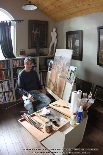
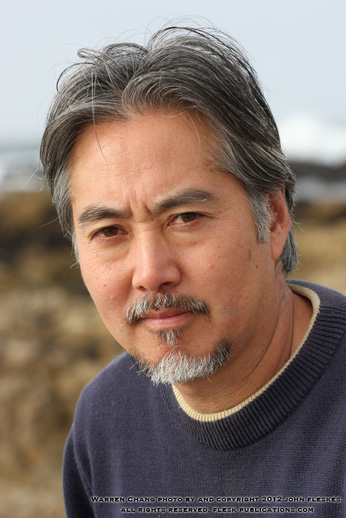
Warren Chang in his studio.

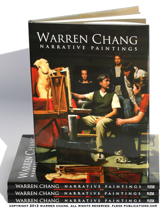
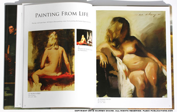
With our new book, Warren Chang: Narrative Paintings, available, I thought it a good time to sit down with Warren Chang and ask him some questions. The time spent with him in producing this book has been one of pleasure. I’ve found Warren to have a deep knowledge of himself and his paintings. We talk about sincerity, balance, choice of subjects, family and more to find how all of these ingredients make Warren the painter that he is.

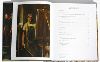
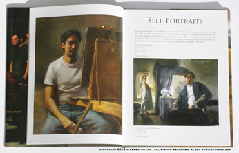
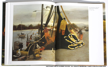
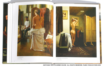
Sample spreads from the book are interwoven throughout. They can be clicked on for larger views.

Warren Chang: Narrative Paintings Book Interview
Copyright 2012 John Fleskes and Warren Chang. All Rights Reserved.

John Fleskes: Why select the title “Narrative Paintings” for your new book collecting your fine art paintings?

Warren Chang: I addressed this subject to some extent in the preface of my book. I think it describes the kind of painting I do well. Frankly the word “narrative” implies to the contemporary art world that the art is “illustrative,” not to be taken seriously. I wanted to embrace my roots and take ownership of the narrative and illustrative nature of my artwork. My work is narrative in nature but not obvious. I think a work of art is more powerful when there is an air of mystery. It’s more open to interpretation and the story is not too spelled out.


Fleskes:
When people view your paintings what do you hope they get out of them?

Chang: I hope they “get it.” Now what exactly that is, I’m a little reluctant to talk about, but certainly there is a certain mood; a feeling that I’m trying to convey. If I have to spell that out, then it’s probably not working. The art should speak for itself.

I do feel it’s open to interpretation and the viewer, as participant, is also part of the creative process in that the viewer also must be an artist in how they view any work of art.


Fleskes: As a painter, do you intentionally attempt to project feelings through the use of color and imagery into people when they view your art?

Chang: Yes, absolutely, nothings an accident.


Fleskes: I hear you speak of “honesty” and “sincerity” with your paintings often. What do you mean by this and why is it important to you?

Chang: If a piece of art is honest and sincere then it will connect with some part of your audience because we all share a common humanity. I can only paint or communicate what I feel or believe and only hope that others will relate. In that way, an artist bares his soul, it can be a little unsettling observing the reactions to one’s work.


Fleskes: With “Narrative Paintings,” besides this being a gallery of your fine art spanning the last decade, you incorporate your own text with each work. What is your goal with this collection? Who do you envision this book is for?

Chang: The accompanying text is simply there to help shed more light on the thinking and process of each painting. If we look back historically, we can only wish we knew what motivated the great artists’ of our past. So with a contemporary painter, like me, it’s nice to have the opportunity to convey these thoughts in a book.

The one word I can think of for the goal of this book is to “inspire.” I hope this is not asking too much but I hope this book will inspire artists and would-be-artists around the world.


Fleskes: How does family and a balance in your life relate to your paintings? What do you need in your life to paint to the best of your abilities?

Chang: I think these two questions can be addressed at the same time. A good friend and fellow artist once remarked to me that perhaps my family was a bit distracting to my art. In fact he was correct, but honestly, without them I’d be lost and even less productive. I owe everything to my family. They give me the stability and purpose to focus on the work at hand. In fact, much of my work is really about “family.” The interiors are pretty much biographical and my family seeps into the subjects and focus of many of my paintings.

So if my family gets in the way of my work at times, I wouldn’t have it any other way.


Fleskes: Do you have a favorite piece that is reproduced in “Narrative Paintings” and what makes it successful to you?

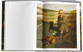
Chang: That is a hard question. There are many I’m fond of and for so many different reasons. Right now, I would have to say its “Entrance to Highway One,” The painting depicts a homeless drifter on the edge of a highway. It was painted specifically for a traveling exhibition titled “Hard Times: An Artist’s View” in 2010. We were asked to paint are reactions to the current economic times which seemed to mirror, to a lesser extent, the Great Depression of the 1930’s which inspired so many great paintings from that era.

The model and painting seemed to epitomize the theme of the exhibition. I was greatly inspired by the theme of the exhibition; a theme of what seemed to me of much substance and in the company of so many artists I had admired, such as Burt Silverman, Harvey Dinnerstein, Max Ginsburg and Steven Assael.

A friend upon observing my two painting of homeless men for this exhibition, one being “Entrance” and the other “Portrait of Bill,” which depicted an old homeless man, remarked that in “Portrait of Bill” you see this kind of a homeless man in all times, while in “Entrance” the man is able bodied and capable of work, yet drifting and homeless. “That’s me if I lose my job,” he remarked. “I would be right there alongside him along with my family and dog.” It dawned on me that the character I had portrayed was “every-man” and that the common man could relate to the plight of this man. So in that way, it succeeded.
I can’t tell you how much I searched for just the right homeless man for these two paintings; the extents I would go to find the right subject. More often than not finding the right subject, or in this case, the right model, can contribute so much to the success of a painting.


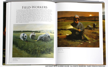
Fleskes: You often portray the every-man and every-women, field-workers, and sometimes the disenfranchised. What is it about them that are attractive to you? Why is it important that you document them?

Chang: Good question. I don’t have a background of hardship, of having worked in the fields, or anything like that. I grew up relatively comfortable, although as a minority in America. I grew up in and continue to live a normal middle class life, so my attraction to the struggling class of people comes from something. But, I’m not exactly sure. I somehow do relate to their plight as I feel it’s the plight of all man throughout history.

Philosophically, I feel in great art, the struggle for life, even tragedy, as demonstrated by the plight of the field-worker for example, goes deeper, has more substance in terms of the sense of humanity that we all share.


Fleskes: Why do you think people find your choice of subjects so appealing? Is the connection formed between them and your paintings intentional, or are you being purely true to yourself and people connect to that instead? (The honesty?)

Chang: I don’t know that people do find my choice of subject appealing. If they do, that’s great.
I paint what I paint regardless of the reaction or whether or not it “sells.” I have found that some people connect with my paintings of the fieldworkers and usually for different and varying reasons. And it’s these reactions that actually inform and educate me on the subject, so it’s an ongoing process.


Fleskes: Your compositions vary from painting to painting making each truly unique. There appears to be a lack of redundancy. Each one is a singular statement. Can you talk about this and why is this important to you?

Chang: Yes. I once was told by a gallery director that, “I don’t need to reinvent the wheel every time I paint a picture.” For me, almost every painting is an entirely new project and undertaking. It’s like I’m writing a new novel or making a new movie.

It often takes me months, if not years, to formalize an idea for a painting. I envy those painters who seem to repeat the same theme over and over again, varying little from one painting to the next. It’s this direction the commercial galleries prefer once they discover a product that sells, and perhaps that may be why I’ve had little success there.


Fleskes: I’ve heard you say that you value the “thinking” behind your work more than anything else, such as the skills behind a painting. Can you explain?

Chang: What I was just elaborating on, kind of explains that. There is an old Chinese proverb, “Read 100 books and paint one picture.” I find a lot of truth in this statement. You have to think before you can create anything of substance and meaning.

I’m alarmed with the over preoccupation with style, and technique and skills in art today. We forget that these are only the tools to creating great art, not an end in itself.

Warren Chang.

Fleskes: What have you discovered about yourself through painting?

Chang: I’ve discovered that art is life. Searching for the meaning of art is the same as searching for the meaning of life. There are no answers but that does not mean we don’t keep searching and trying to figure things out.


Fleskes: Thank you for your time, Warren.

Enjoy,

John

John Fleskes
Flesk Publications

Links:
Warren Chang Narrative Paintings at Flesk Publications
Warren Chang official website

Craig Elliott Interview Discussing “The Art of Craig Elliott”

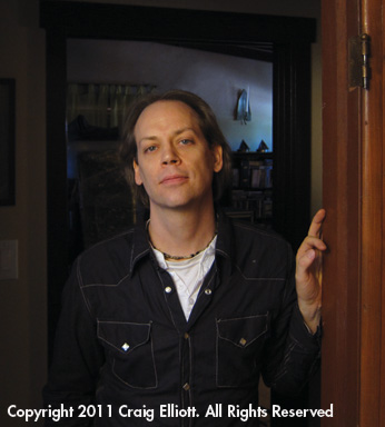
With the release of The Art of Craig Elliott, I thought it a good time to ask Craig Elliott a few questions regarding his new book and his philosophies regarding his art and life. I would like to extend a special thank you to Craig for taking the time to respond.

Craig Elliott “The Art of Craig Elliott” Interview
Copyright 2012 John Fleskes and Craig Elliott. All Rights Reserved.

John Fleskes: You obviously have your own creative and artistic style. Do people sometimes make references to other artists that share your same sensibilities when viewing your work? How do you feel about this?

Craig Elliott: People occasionally mention other artists they “see” in my artwork when they meet me at shows or gallery openings. I find it fascinating that people choose other artists that have the same interests as I do. Our interests and motivations are the things that really create our art. People will point out artists that have, or had a strong interest in Japanese art, a deep love of nature, and of women, especially women in their “natural” state, without much influence of modern society’s specific demands upon their looks. These interests that I have combine to create my art, and combine in other artists to create their art. I think people respond to a feeling that is transmitted by those interests. We almost all will have had different teachers, teaching different drawing methods, ways of applying paint, preparing canvases, etcetera, so the specific techniques and details are different, but these interests that flow beneath the art are shining through.

Fleskes: What is it about women and nature that inspires your fine art that is featured in The Art of Craig Elliott? Why not men and nature?

Elliott: I think women are just about the most beautiful thing in the universe for a human male. Evolution and time have made it so there is no equal to them in all the world for us. Nature also is built on many of the same principles of beauty and design that women are, but can never quite overcome women in a man’s mind. It is a very strong second though!

Fleskes: You stay very busy with visual development work, character designs and conceptual art for the film industry. How do you find the time and energy to work on your personal fine art? And why is it important for you to create work that reflects your own inner vision, rather than purely the film and commercial assignment work that you do?

Elliott: I don’t really have an opportunity on a daily basis with my concept design work to put my own ideas to paper. I work to realize and flesh out the ideas of writer’s story artists and directors, and I consider their ideas the paramount consideration when I am doing a job. Only if they ask me to fill in a gap in their own minds do I step in and offer my own ideas. I can remember a time on Treasure Planet when the directors, John Musker and Ron Clements had a problem they had not yet solved in the story. This problem was how the main characters were going to escape from the stockade with the pirates sitting outside the door all night. I had an idea inspired by a type of plumbing valve, when it was mentioned that they had no solution for this problem! I adapted the valve to create these mysterious half spheres in the floor of the stockades interior. Our characters could, with a little initiative, fool around with them and discover that they would rotate, and eventually align an opening in the floor to let them escape. I drew up some simple plans and pitched the idea to the directors, and they used it!

Aside from these little ideas I don’t have an outlet at work to express the other ideas that come to me. Ideas for my art come to me while I am sketching compositions for work, taking a walk, driving, watering the plants, looking at books, all sorts of times. These ideas reflect my own story, the things that strike a chord for me. I don’t know what it would be like to not express my own vision in some way. It is hard to say why it is important, when it is just something that I do, or am. It really is like magma in a volcano, bubbling up from below, if not released it can explode. I have had stretches of time where I have not been able to do much art of my own. I remember once I had to go a month or two without doing anything because I was buying and moving into a new house. I had no furniture, dirty carpet and torn up linoleum. I had no art supplies either. I bought food and some sculpting supplies and sculpted for days, sleeping on the floor! I had to get it out or I would blow up! After that I could move in my stuff and get more settled. As for having the time or energy to do my own work as well, I guess the compulsion makes the energy and time for me. I have no choice!
Never the Twain by Craig Elliott.

Fleskes: Is your fine art created to satisfy and bring pleasure to you, or others? Maybe both, and if so, who comes first?

Elliott: I am really making things I want to see, or places I want to be in when I am creating my fine art. I have heard a few times that Disneyland was the place Walt wanted to live in, or play in. It is that same sort of idea. There is a hope that others will like what you do, and you can somehow support the continuation of your art with their interest and support.

"Jade" by Craig Elliott

Fleskes: Which is the painting you are the most proud of in The Art of Craig Elliott? What stands out about it?

Elliott: I think Jade is the painting I would chose as an answer to this question. It was a real breakthrough for me, and was the first time I did something that came close to the style I had in my head… It is also my late grandmother’s favorite painting. I also thought of this painting as representative of why I would be satisfied with the life I had led if I were to die. This may seem morbid, but I was faced with two weeks to live when I was 26, and actually thought of this painting when I was alone in the hospital, and said to myself “well, if this doesn’t work out I can look at Jade, and be satisfied that I had done something I can leave behind that really means something to me.”

Fleskes: Do you think your art is the result of a talent, or hard work?”

Elliott: I don’t really think there is such a thing as talent. If I compare how much time I have spent honing my skills, and thinking about art, I feel like if I have any ability as an artist, it had better be as a result of all of that! I have never done much else besides art, I don’t know if that makes me obsessed or something, I don’t know. For me it comes down to there being very little else that is nearly as interesting. Movies, bars, parties, clubs, sports, etc. are so boring to me, though most people really enjoy them. I wish I could understand, or get some enjoyment out of more things, but we are all different. At least there is something I enjoy!

Fleskes: We’ve spoken about labels and how people like to put artists into categories. This is something you don’t like to do. Why is that? And how do your respond when people label you?

Elliott: Though it is frustrating, I have enough understanding of the way the brain works to forgive that sort of knee jerk categorization. Our minds work by association, categorizing things in terms of other things the brain has already seen or experienced. This behavior makes perfect sense and is a very efficient way of dealing with the world. It has some side effects like stereotyping. Stereotyping is applying what you have experienced about “X” to other things that are, or seem, similar to “X.” The negatives of stereotyping are obvious, but it also helps our brain not have to spend hours assessing every individual situation or thing it encounters, and be able to make reasonably accurate decisions in very short time. If someone pulls into your lane on the freeway, you can use previous instances of that event to help you quickly decide what do to and what might happen next. If you wait and analyze the situation like it is a completely new one, you will end up in a crumpled mess by the side of the road!
Fleskes: How well does The Art of Craig Elliott represent you as an artist and as a person?

Elliott: I hope the overall impression of the art in the book gives people the sense of how I feel about the world, and an understanding of the beauty I see in it. I have had some feedback from the few people who have seen the book already, that they get a feeling of the flow and rhythm of nature from my work. That is much more the subject of my art than the physical things like people, grasses, branches, etcetera, that you see in the art. I am trying to capture something that I feel from nature. It really may not matter much what subjects I am painting in the end. That feeling is what actually matters.

Fleskes: What do you want people to know about you in relation to your art?

Craig:
I am not sure if I have thought about that much. I try and stay out of the way of my art I think. I think I am afraid of influencing, or “messing up” their experience of the art with “me stuff.” I am always willing to answer questions that are asked of me, of course. Although, I think many of the most important things about me as a person are right there in the art. If I am doing a good job, the experience of my art should be similar to knowing who I am as a person.

Fleskes: The Art of Craig Elliott was designed by you. This is something I am happy about since a goal of mine is always to get a deeper connection between artist and book for a true representation of the pair. During the design stages, what are your thoughts behind your decision with the flow and pacing? What do you feel is most important when grouping your art into a collection?

Elliott: I really tried to approach the layout of the book the same way I do my art. To include and adapt things I already love into the design the whole way through: Natural textures, mysterious layers and unusual proportions and divisions in the layouts. I think the way the book flows as you move from page to page and move through groups of related subjects is important too. I apply the same ideas to my portfolio. I do so many different things that if I am not careful about how I group things and make them flow into one another, it would seem like I was a total scatterbrain. When things move gracefully from one subject to another instead of jumping all over the place one doesn’t even notice the transitions or the number of subjects.

Fleskes: When you work on one of your sketches or paintings, what do you think is more important, the idea or the technique?

Elliott:
The technique should always be secondary, but that isn’t always possible. The ideal is to practice technique until it becomes second nature, so that one can concentrate on the idea! It is a very Jedi like thing to play baseball, ride a horse or paint! They all require that “let go” moment…

Fleskes: You are one of those artists I consider a triple threat. You are an excellent artist, successful at running yourself as a business and independent free-lance artist, and a great self-promoter by making appearances at shows and running your own booths at events. I suppose I could add that you do occasional workshops and teach as well. My question is, was this all planned, or part of a natural progression of who you are? How important is being well-versed in different areas to you?

Elliott: I don’t see it as important per se, but maybe more “helpful.” Maybe that is the same thing! I realize the value of all these elements, and strive to do what is best for me and my art.

Craig Elliott jewelry collection.

Fleskes: Your artistry extends beyond drawing and painting. If you look beyond the many forms of art you have your fingers in, in addition, you are a sculptor, make your own fine art prints and create lovely jewelry, as well as having much interest in landscape design, among other things. Do you look at all of your interests as strengths, or a lack of focus? Is it boredom, or an honest love for life in enjoying so many different things?

Elliott: I really do enjoy doing these different things, and I think it is driven by a stream of ideas that I get excited about. Having so many ideas is tough, as I never have enough time to execute them all. It is frustrating, and I always feel behind! I guess we do the best we can in the circumstances.

Aristata sculpture in progress by Craig Elliott.

Fleskes: Where do you see yourself going in the future? Any achievements you would like to conquer that you haven’t focused on yet?

Elliott: I do want to find a way to bring my three-dimensional work to the public. Dimensional work was the very first art form I practiced, and it is still a big love of mine. I think it is much harder to bring to people though; there are many impracticalities that make it clumsy, costly and ungainly to do. I feel like I am much closer to a solution, and my jewelry is a good first step!

Fleskes: Thanks for your time, Craig!

Links:
The Art of Craig Elliott at Flesk Publications with video tour.
Craig Elliott Gallery official website
Flesk Publications

William Stout, Production Designer of “The Return of the Living Dead” Interview

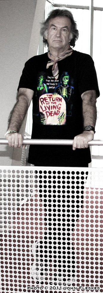
The Return of the Living Dead production designer, William Stout. Photo by John Fleskes.


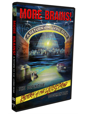
Since its release in 1985, The Return of the Living Dead’s cult status among zombie filmgoers and inspiration upon subsequent zombie movies has continued to grow at a sharp rate. 2011 has proven that people can’t get enough of the film. A handful of sold out appearances of the entire cast and crew at horror shows and film events, the success of the book, “The Complete History of The Return of the Living Dead” that was released in early 2011, and with rave reviews for the new documentary, “More Brains! The Definitive Return to the Living Dead Documentary,” have all proven this film is not about to fade into the past anytime soon.

I took the opportunity to contact William Stout, who was the production designer of the film, to ask him some questions about his contributions to the film, and how he feels about the recognition he is receiving for work he did over 25 years ago. Stout opens up in the following interview to give us his insight into the film and even a new never before told story.

Flesk: You were the production designer for The Return of the Living Dead. Can you give me some insight into what a production designer does?

William Stout: The production designer functions as the eyes of the director. He is responsible for everything you see on the screen except for the performances of the actors. As production designer I oversee all of the set designs, creature designs, special effects, props, costumes, set decoration, storyboards, make-up and special make-up effects. I usually have about 1200 people working under my supervision.

Tar-Man production art by William Stout for The Return of the Living Dead. Artwork © Stout.

Flesk: What type of role did you play on the film?

Stout: I directly designed most of the sets, the special effects shots, a lot of the set decoration and all of the zombies. I storyboarded several crucial scenes as well.

I’m a very hands-on production designer. I was under the gurney of the Half Corpse, for example, making her spinal cord flop around and ooze spinal fluid. I was on set every day of the shoot, which was easy when we were shooting interiors. I just had to step out of my office to be on set!

It was my idea to have a butterfly collection come alive at a crucial point in the film. I built it, cutting paper butterflies from butterfly books, then pinning them to a collection board. When it was time to shoot it, I was the guy behind the camera waving a clipboard at them to make their wings appear as if they were fluttering.

I have a cameo in the film as the alcoholic bum the punks step over in the beginning of the movie. I designed my own make-up and wardrobe! I was originally cast by the director to be the shopping cart bum who gets bitten by Trash (Linnea Quigley) but our producer nixed the idea. He figured (quite rightly so, I believe) that I had enough on my plate as production designer. I sculpted Trash’s face for that scene. I rarely sculpt — there are other people who are better and faster than I am — but Dan O’Bannon, the director, insisted.

Flesk: Did you ever expect for The Return of the Living Dead to become a cult favorite and receive the type on ongoing attention that seems to continually grow?

Stout: Not at all! I don’t care who you are in the Film Biz; no one knows if they’ve got a hit or a miss until they have that first screening with a real movie audience — and even then they might not know! It amazes me that The Return of the Living Dead is more popular now than when it was first released and that its popularity shows no signs of letting up. It’s the best movie ever made for a lot of people. That blows my mind, as I think everyone should realize that the 1933 King Kong is the best movie ever!

Flesk: What do you think it is about The Return of the Living Dead when compared to the many other horror and zombie films that have come out that makes this one stand out as such a cult favorite?

Stout: 1) It’s really scary. 2) It’s really funny. Very few films have ever pulled that off. The only other ones that immediately spring to mind are Abbott and Costello Meet Frankenstein, a real favorite of mine, plus that great opening to An American Werewolf in London. Both films play the horror aspects very seriously, which creates a nervous tension that makes the funny stuff even funnier.

Flesk: How rewarding is it for you to have the recent group events with the entire cast of The Return of the Living Dead?

Stout: It’s a total blast! I’ve worked on over forty feature films, yet TROTLD is the only one out of all those films where I have stayed really close to the cast. We’re all such good buds; we love being with each other. To use a show biz cliché, we truly are like family.

Director Dan O’Bannon gave us a tremendous gift when he fought for — and got — two weeks of rehearsal prior to shooting. Since the film hadn’t been totally cast, I stood in for some of the roles during rehearsal. During those two weeks the cast and I all bonded as friends. I think it made the performances much more believable in the movie. These characters really feel like they have a past together.

Flesk: There was a recent book about the making of The Return of the Living Dead and now the new More Brains! documentary. Do you feel they both captured the process well and the stories behind the film?

Stout: Both the book and the DVD are terrific; everyone really did their homework. While not every great story regarding the making of TROTLD was told, between the book and the DVD, most of them were. Making that movie was a wild experience from start to finish, mostly thanks to Dan O’Bannon.

Flesk: When you were hired as the production designer I believe you were the youngest in film history to assume that role. Were you intimidated by the position and responsibility?

Stout: Yes and no.

Yes, because despite having already worked as a designer on several major films (Conan the Barbarian, Raiders of the Lost Ark, First Blood, Conan the Destroyer, Clan of the Cave Bear), I was always working under a top production designer. I paid attention on those films and learned as much as I could. TROTLD, though, was the first movie in which I was the guy who would be completely responsible for what ended up on the screen.

No, because I was young and pretty cocky. I thought I could do anything! I had also spent the two years previous to TROTLD as the production designer on an American Godzilla movie that, unfortunately, never got made. I gained tremendous confidence working on that film. On Godzilla I got to hire the cream of the Movie Biz’s top talent: guys like Rick Baker, Dave Allen, Dave Stevens, Doug Wildey and Stephen Czerkas, for example.

Flesk: How did you approach such a massive undertaking?

Stout: Fortunately, TROTLD’s line producer sensed how green I was. He assigned me Robert Howland as my art director. Robert was such a great, seasoned pro; he saved my designer butt on a number of occasions. I used Robbie again as my art director on Masters of the Universe. I miss him and his great sense of humor enormously. He died from AIDS after Masters.

Flesk: Were you ever concerned that the film would be considered campy due to the comedy infused in the film? Did you feel like you were creating a serious work at the time?

Stout: We took our little film — and its comedy — very seriously. Dan pushed the actors to go a bit broader than I would have but he knew exactly what he was doing. I don’t really consider TROTLD to be “camp” and, actually, I don’t think I’ve ever heard it referred to as being camp. Funny, yes; irreverent, yes; imaginative, yes; outrageous, yes; scary, yes. But camp? No. I think it’s just damn good. It accomplishes what it set out to do.

Flesk: Do you have a memorable story from working on the film that you can share?

Stout: Let me see if I can think of a TROTLD story I’ve never told before…

Because of the nature of the film, it could be pretty creepy on set. We were shooting at the downtown Los Angeles location of the Uneeda Medical Supply warehouse (actually a downtown loft apartment). It was beginning to get dark. While waiting for the lights to be set up, I began poking around our location. Amidst a small pile of rubble, I spotted an anomaly. It looked like there was some blond hair slightly sticking out from the top of a cardboard box. Upon closer inspection, it looked like the beautiful blond hair of a woman. I feared I might have just discovered a decapitated and clumsily discarded severed head. This was downtown L. A., after all, so it was in the distinct realm of possibility.

I sought out the police officer we had employed on set and brought him over to the box. He approached it very cautiously, drawing his weapon. With the barrel of his gun he nudged open the cardboard flaps of the box.

Inside was a very blond, very dead…longhaired cat.

Oh, the things one imagines when making a horror movie!

Flesk: Thanks for your time, Bill!

Enjoy,

John

John Fleskes
Flesk Publications
Interview copyright © 2011 John Fleskes and William Stout
William Stout photograph © 2011 John Fleskes
William Stout Tar-Man artwork © William Stout

Links:
The Complete History of The Return of the Living Dead book
More Brains! The Definitive Return to the Living Dead documentary
William Stout website
William Stout books at Flesk Publications

More Brains! The Definitive Return of the Living Dead Documentary.


The Complete History of The Return of the Living Dead book cover